The following are some guiding principals that will help ensure that the most important information is visually highlighted by the layout of your landing page. This is essentially a conversation about how to establish an effective "Visual Hierarchy" on your Landing Page. Visual Hierarchy refers to the phenomenon of drawing site visitors' attention through the use of various visual elements such as font style,
...
imagery, or
...
spacing.
| Info |
|---|
Key Concept: Limit your use of "attention grabbers" |
...
|
...
; For example, a Call-To-Action |
...
button |
...
. Too many buttons dilute their significance and leave your site visitor unsure where to go or what to click on. Keep it focused. |
Next we will explore a few other key concepts for creating effective visual hierarchy
...
: size, color, and placement.
Size
...
The larger a piece of content is on a page, the more it is likely it is to be seen, and the more important it will seem. For page layouts, this
...
can mean making
...
one or two important pieces of content
...
stretch the full width of the page.
You can also increase size by simply adding more content to a page block
...
; For example, a description or image
...
. It could also mean that instead of including
...
one particularly important link in a Link Collection block, you
...
separate it into a stand-alone Promo block so that it takes up more space on the page. (Speaking of Promo
...
, you might try the “big description” display option to make it more visually prominent on the page.)
...
Color
...
In the example thumbnail to the right, the dark section in the middle of the page
...
has high contrast with surroundings. It
...
's important to understand that contrast at a most basic level just means
...
“difference.” Contrast is not something that is inherent to any particular color
...
. In
...
this example
...
, the contrast is created because the
...
green band is a much darker color than the surrounding light grey sections. The same
...
green would be low contrast if the sections above and below were a darker color.
Contrast
...
also
...
helps the white card
...
stand out within
...
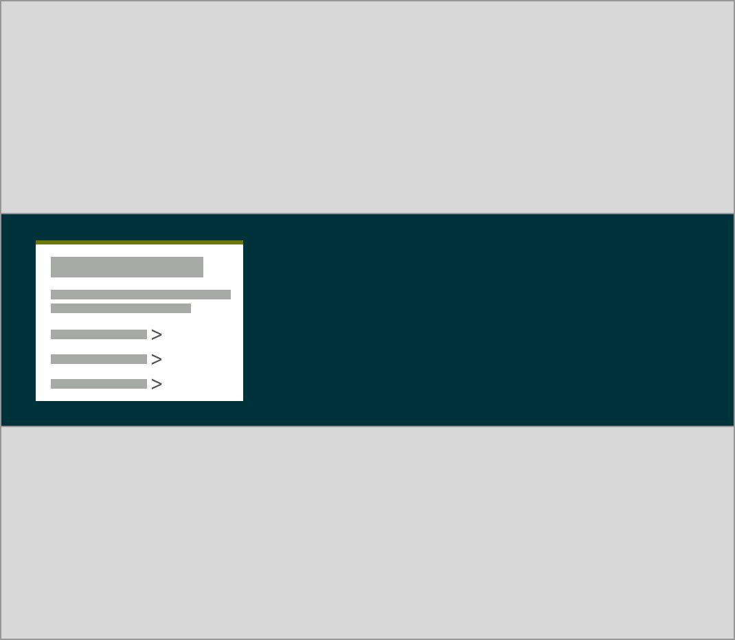
Warm Colors
...
its dark green section.
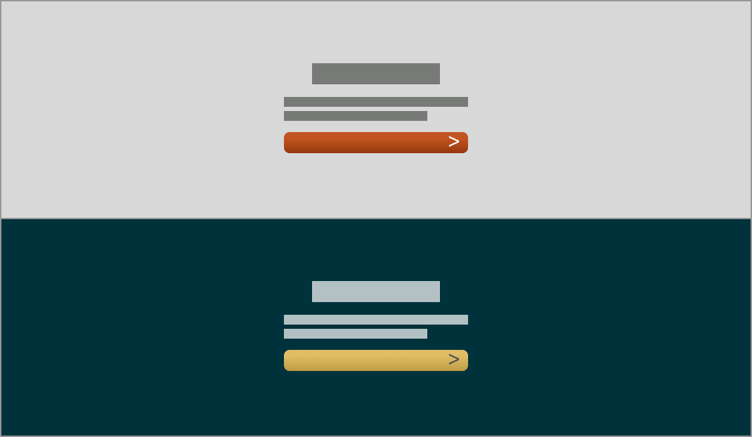
Warm Colors
...
Generally speaking, warm colors (red, orange, and yellow) tend to be more noticeable, while cooler colors (
...
green, blue, and purple) tend to fade into the background. Because of this, all buttons on
...
GovHub websites are designed
...
to use warm colors
...
: orange on light backgrounds, and gold on dark backgrounds.
Placement
...
The
...
“F-shaped scanning pattern” describes a common way that people tend to visually scan through websites. This pattern was discovered through eye-tracker studies in which the participants wear glasses that can pinpoint the focus of their gaze on a webpage. The warm colored splotches
...
in the screenshots to the right are the most frequently focused on content.
What this pattern tells us is that, generally speaking, site visitors tend to
...
:
Look across the top of the page from left to right
...
Scan down the left side of the page until something grabs their attention
...
Scan from left to right along the line of the thing that grabbed their attention
...
Continue scanning down the left side of the page until they lose interest or reach the bottom of the page
...
Take advantage of
...
this pattern by purposely placing key pieces of content
...
at the
...

...
top and left side of the page. The page title should clearly indicate what people should expect to find on the page. Moving down the page, headings should introduce the content under it. If the page is set up with multiple pieces of side-by-side content (like is common on homepages), make sure that the left-most item is indicative of the information to its right. With thoughtful placement of content, the site visitor can quickly find relevant information.
Spacing
...
Leaving empty space around an object also helps it to stand out. Ample use of empty space
...
helps keep the page from feeling cluttered and makes it easier to navigate.
In the example to the right, there is a 2
...
-column section with at the top,
...
a 1-column in the middle, and a 3-column section at the bottom. The middle 1-column section helps break the page up
...
and focus the user’s attention.