To help keep your site neatly organized and flowing easily for reading, all images in GovHub sites display at specific sizes.
| Table of Contents | ||||
|---|---|---|---|---|
|
Text editor embeds
You can embed stand-alone images into the “What You See Is What You Get” (WYSIWYG) text editor of certain content types.
| Tip |
|---|
Recommended minimum dimensions: images embedded in the text editor
|
| Expand | ||||||||
|---|---|---|---|---|---|---|---|---|
| ||||||||
When you embed an image in a text editor, you have the option of three embed alignments: full width, left, or right. The alignment you choose determines how large the image will display. The image will scale proportionally to the system-determined width, keeping the original aspect ratio of the image. This chart shows the actual largest dimensions at which an image will appear in each of the described situations:
Note: Though images that are embedded left or right display smaller on desktop (up to 335px and 580px respectively), all embedded images display the full width of the window at the mobile breakpoint Images smaller than the available space will not grow to fill the space. |

| Note |
|---|
Images that smaller than the available space will not scale up and will leave empty gaps on the page. |
Micro-content images
The images in blocks placed on a Landing Page will scale to a specific size and crop to a specific aspect ratio. By default, these images will crop towards the center of the image, but you can adjust the focal point on each individual image. The image will always fill the available space, showing as much of the image within the crop as possible.
| Note |
|---|
Images that do not meet the following minimum dimensions will scale up and may appear pixelated. |
Common crops
The following crops and minimum dimensions apply to images in the following types of blocks:
Spotlight
Calls to Action
Link Collections
Promos (normal display)Promo
Tile withouttext
Since Tiles with the “Image” layout are most often used for logos, try to use a more square (rather than wide) logo layout, when possible. You’ll probably need to add some white space around it to make sure no part of the logo is lost when the image is cropped into a square.
| Tip |
|---|
Recommended minimum dimensions: common Micro-content images
|
| Expand | ||||||||||||||||
|---|---|---|---|---|---|---|---|---|---|---|---|---|---|---|---|---|
| ||||||||||||||||
This chart shows the actual largest dimensions at which an image will appear in each of the described situations:
Note: When you place these blocks into a full-width region, the image will display to the left of other block content, at a 4:3 :2 ratio. It will be the same size as an image in a 1/3-width block. |
 Automatic Lists of News teasers
The image that displays in a News teaser comes from the “Teaser image” field on the News node. Automatic Lists of News will show this image when you select “Teaser” as the display mode.
| Tip |
|---|
Recommended minimum dimensions: News teaser images
|
| title | Exact Dimensions |
|---|
The aspect ratio and size of the image depends on both the placement of the block and the number of teasers in the block. Sometimes, depending on placement and number, the first teaser in a list will display automatically in a “featured” style, affecting the image crop and size.
This chart shows the actual largest dimensions at which an image will appear in each of the described situations:
Block placement
# of teasers
Crop ratio
Width (px)
Height (px)
Full-width region
4, 3, 2, or 1
3:2 (all teasers)
700
467
2/3-width region
4 or 3
2:1 (first teaser only)
3:2 (remaining teasers)
950 (first teaser)
700 (remaining teasers)
475 (first teaser)
467 (remaining teasers)
2/3-width region
2
3:2
700
467
2/3-width region
1
2:1
950
475
Note: Automatic Lists of News teasers will never display teaser images when placed in 1/3-width regions, even if you select the display option “Teaser” (which normally would show an image).
Hero
The Hero block works best with high quality, mood-setting images that do not need to be cropped in a very particular way. The space filled by the image will stretch to the right edge of the window, and grow taller as as you add more text to the blockHero
Heroes (both large and condensed) display with a flexible crop, which depends on content and viewport width. The image pins to the center, so it’s best to crop it so the focus is in roughly the center of the image. Sometimes it can help to offset the focus a little to the left (if using the large display) or to the right (if using the condensed display) to address where it overlaps behind the text area.
| Tip | |||
|---|---|---|---|
Recommended minimum dimensions: Hero image
| |||
| Expand | |||
| |||
This chart shows the actual largest dimensions at which an image will appear in each of the described situations: | |||
Block placement | Display style | Width (px) | Height (px) |
Full-width region | Narrow text, wide image | 1230 | 820 |
Full-width region | Wide text, narrow image | 800 | 534 |
| Note |
|---|
Do not use a Hero image for imagery that requires a specific crop, such as text or an image with a watermark in the corner. The visible portion of the image changes with amount of text, display style, and window width. |
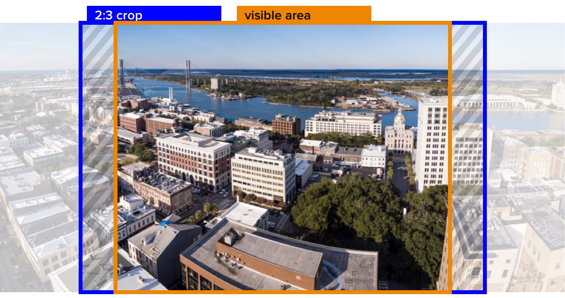
Though a Hero image might display particularly wide and short, the underlying image actually has an aspect ratio of 3:2, no matter what dimensions your originally-uploaded image was.

Then after the original 3:2 crop, the final visible area is determined by the height of the Hero. This changes with amount of text, display style, and window width.
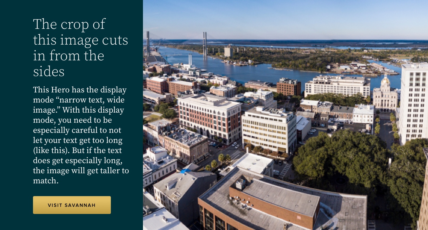
The long text in this Hero makes the block particularly tall. The image crops in further from the sides to accommodate. Be careful to upload a larger image when this will happen.
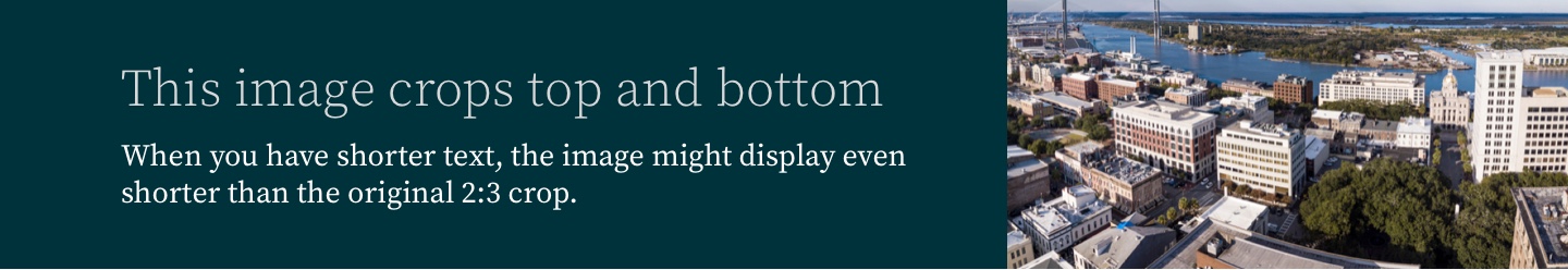

At this particular window width, the block is fairly short, so the image will crop from the top and bottom.
Tile With Text
Images in Tiles will always display as squaresdisplay at a 16:9 ratio. When choosing an image, keep in mind that the top and bottom will be cropped.
| Tip |
|---|
Recommended minimum dimensions: Tile image with text
|
| Expand | ||||||||||||
|---|---|---|---|---|---|---|---|---|---|---|---|---|
| ||||||||||||
This chart shows the actual largest dimensions at which an image will appear in each of the described situations:
Note: Though Tile images display at different sizes on desktop (up to 335px for Tiles in a full-width region and up to 295px for Tiles in a 2/3- or 1/3-width region), all Tile images display at half the width of the window at the mobile breakpoint. |

Since Tiles with the “Image” layout are most often used for logos, try to use a more square (rather than wide) logo layout, when possible. You’ll probably need to add some white space around it to make sure no part of the logo is lost when the image is cropped into a square.
Since Tiles with the “Image with Text” layout are partially covered at the bottom with the text overlay, keep the main focal point of these images toward the top.
Content Types
Some content types have a specific image field.
Bio
The “Portrait” field on the Bio node crops to a circle on the Bio details page and in Bio teasers.
Other Micro-Content Types
The following types of micro-content display with a 4:3 ratio, but do not use a 4:3 image style:
News teaser
No image style
Call to Action (CTA)
Uses a 3:2 ratio
| Tip |
|---|
Recommended minimum dimensions: Bio Portrait images 350pxCall to Action
|
| Expand | ||||||||||||||||||
|---|---|---|---|---|---|---|---|---|---|---|---|---|---|---|---|---|---|---|
| ||||||||||||||||||
This chart shows the actual largest dimensions at which an image will appear in each of the described situations:
Bio detail page 350 350 News page About the Author 212 212 Landing Page: 335 335 Landing Page: 212 212 Landing Page: 212 212 Note: Styling of Bio teasers within a text editor is still under development. |
Event
The “Thumbnail” field on the Event node crops to a circle on the Event details page. It does not currently display on Event teasers.
| Tip | ||||||
|---|---|---|---|---|---|---|
Recommended minimum dimensions: Event Thumbnail images 350px wide
|
Link Collection
The ratio of images used in a Link Collection varies on placement and the type of image used
| Expand | ||||||
|---|---|---|---|---|---|---|
| ||||||
This chart shows the actual largest dimensions at which an image will appear in each of the described situations: | ||||||
| Expand | ||||||
| ||||||
In almost all cases, Teaser Images will display at a 3:2 aspect ratio. In a few particular instances, it will crop to a 2:1 ratio:
Event detail page 350 350 |
News
The “Teaser image” field on the News node displays in individual News teasers and Automatic Lists of News teasers.
| Tip |
|---|
Recommended minimum dimensions: News teaser images
|
Note: When embedded in the WYSIWYG, some images have a 4:3 ratio (720 x 540) and others have a 1:1 ratio (720x720). The ratios are not dependent upon alignment or specific settings in the Link Collection. At this time, we are not sure of what causes the difference. |
Image Block in Layout Builder
| Expand | |||||||||||||||||||||||||||||||||||||||||||||||||||
|---|---|---|---|---|---|---|---|---|---|---|---|---|---|---|---|---|---|---|---|---|---|---|---|---|---|---|---|---|---|---|---|---|---|---|---|---|---|---|---|---|---|---|---|---|---|---|---|---|---|---|---|
| |||||||||||||||||||||||||||||||||||||||||||||||||||
This chart shows the actual largest dimensions at which an image will appear in each of the described situations.:
Crop ratio
| anyLanding Page:
700 | Landing Page467
2/3-width region | 2:4 or 3
3:2 (remaining teasers) 950 (first teaser) 475 (first teaser) Landing Page: 2 3:2 700 467 Landing Page: 1 2:1 950 475 Landing Page: any no image no image no image Text Editor Embed: any 3:2 746 498 Text Editor Embed: any no image no image no image Text Editor Embed: any 3:2 501 334 News Teaser
Note: Images smaller than the available space will grow to fill the space. |
Content Types
Some content types have a specific image field.
Bio
The “Portrait” field on the Bio node crops to a circle on the Bio details page and in Bio teasers.
| Tip |
|---|
Recommended minimum dimensions: Bio Portrait images
|
| Expand | ||||||||||||||||||||||||||||||||||||
|---|---|---|---|---|---|---|---|---|---|---|---|---|---|---|---|---|---|---|---|---|---|---|---|---|---|---|---|---|---|---|---|---|---|---|---|---|
| ||||||||||||||||||||||||||||||||||||
This chart shows the actual largest dimensions at which an image will appear in each of the described situations.:
3:2 | 467700
2:1 | 475950
700 467 Text Editor Embed: 3:2 746 498 Text Editor Embed: no image no image no image Text Editor Embed: 3:2 501 334 |
Since the image might sometimes crop to a 3:2 aspect ratio, and other times crop to a 2:1 aspect ratio, choose teaser images that can be cropped to both without losing necessary content.

Blue shows the largest possible crop.
Orange shows the “safe zone.”
 If you move the focal point to the top of the image, it will crop like this. (Adjust the focal point when adding or editing an image by clicking on the image thumbnail or clicking and dragging the crosshairs.)
Note: Styling of Bio teasers within a text editor is still under development. |
Event
The “Thumbnail” field on the Event node crops to a circle on the Event details page. It does not currently display on Event teasers.
| Tip |
|---|
Recommended minimum dimensions: Event thumbnail images
|
| Expand | ||||||
|---|---|---|---|---|---|---|
| ||||||
This chart shows the actual largest dimensions at which an image will appear in each of the described situations:
|
Program or Service
The “Logo” field on the Program or Service node crops to a circle on the Program or Service details page. It does not currently display on Program or Service teasers.
| Tip |
|---|
Recommended minimum dimensions: Program or Service Logo images
|
| Expand | ||||
|---|---|---|---|---|
| ||||
The image will scale proportionally to the system-determined width, keeping the original aspect ratio of the image. This chart shows the actual largest dimensions at which an image will appear in each of the described situations:
Note: The Logo image does not currently display at the mobile breakpoint, but it may start to display full-width at mobile in the future. To prepare for the future, we recommend using files that would be large enough in case this happens. Images smaller than the available space will not grow to fill the space. |
Book Cover Image
Displays at a 1:1 ratio
| Tip |
|---|
Recommended minimum dimensions: Book cover images
|