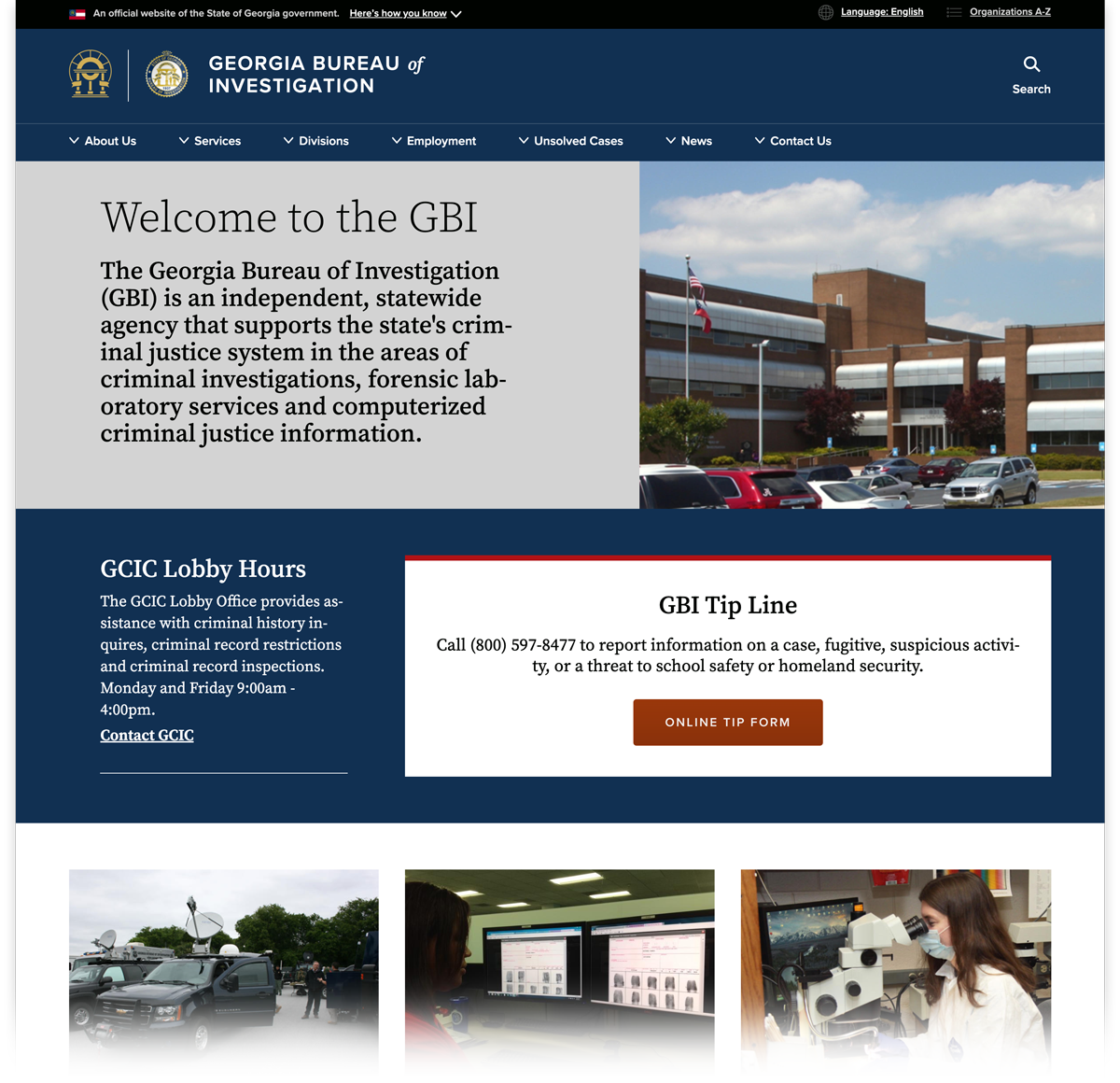
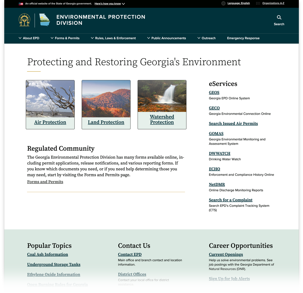
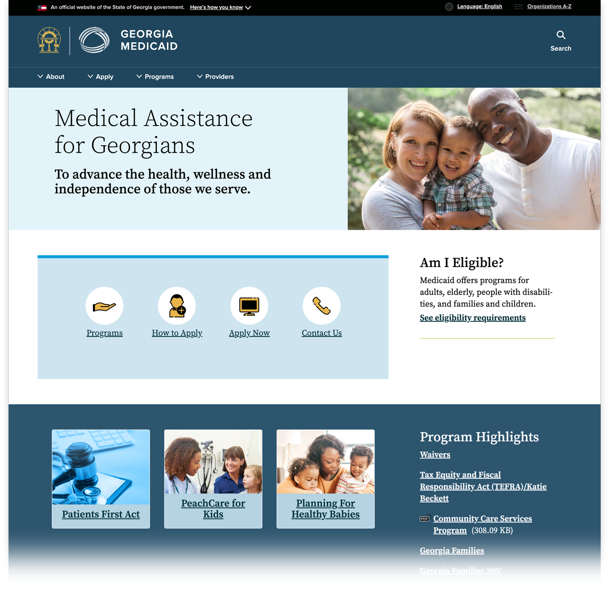
Landing Pages are a powerful tool within the Drupal system. They are a content type that allows for the layout to be laid out in a customized way. This provides a great opportunity to effectively direct site traffic, make a good first impression, and set the right tone for the site.
Your homepage is a Landing Page, and you can also create unique Landing Pages to introduce a sections of content. They are designed to:
Introduce and link to sub-pages
Highlight the most important information
Group content in a logical way
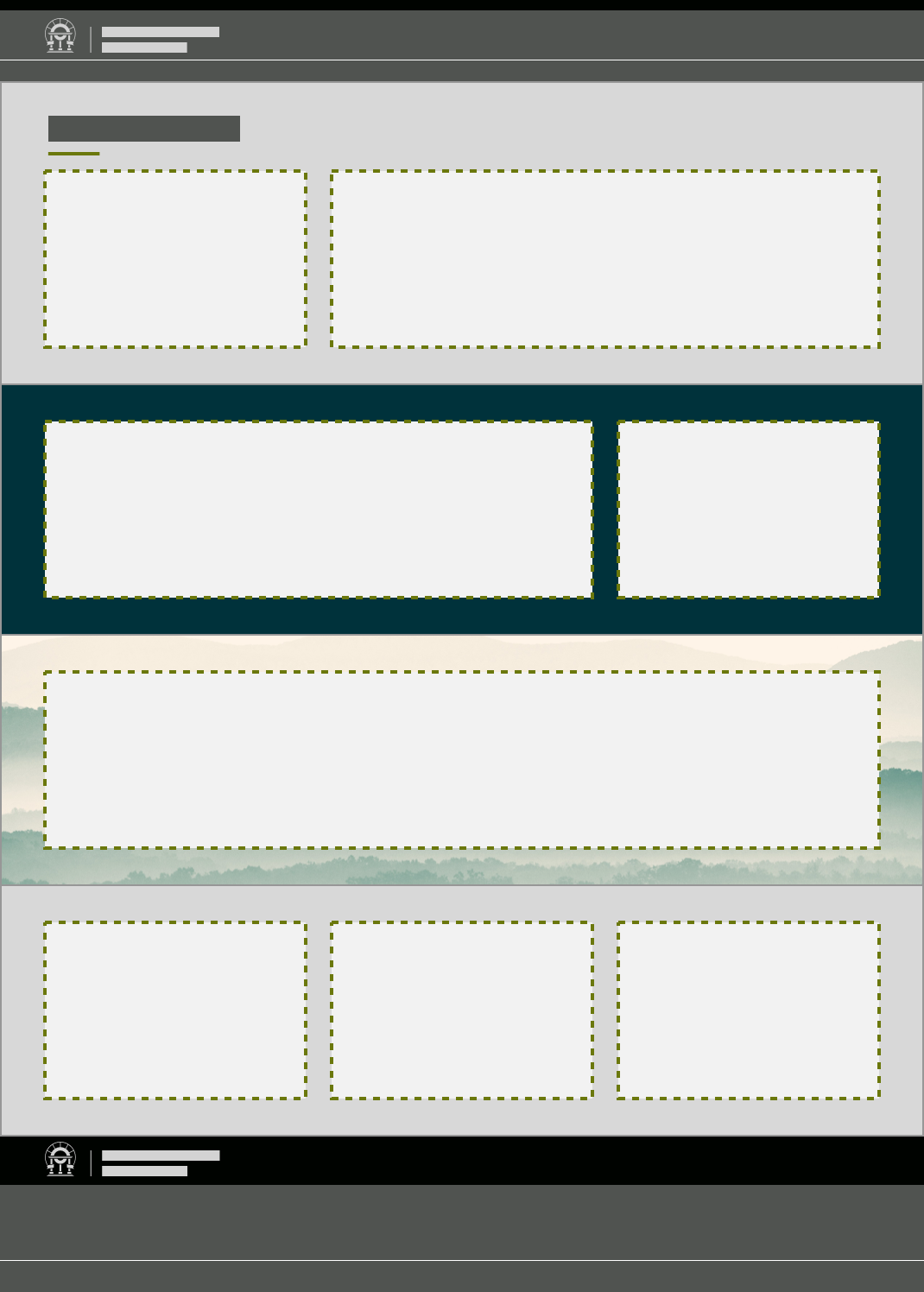
Structure of a Landing Page
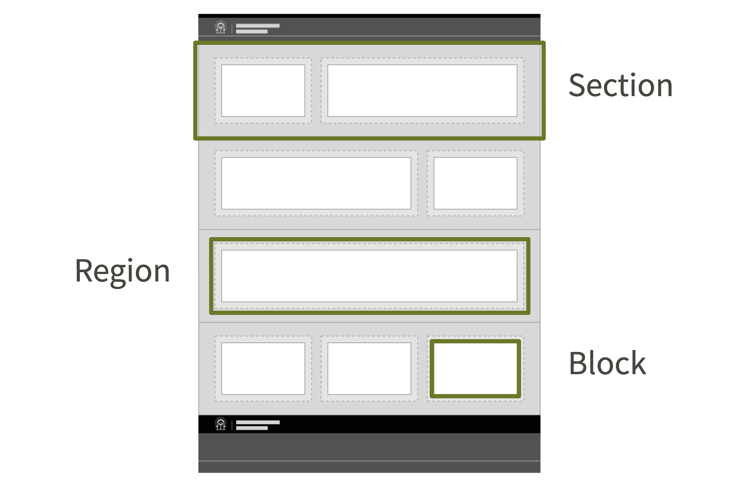
Landing Pages are structured in three nesting components:
Sections – The full-width content groupings. Sections define which chunks of content stay together when the page is resized from desktop to mobile, and they can have a background color, background image, and title.
Regions – Containers for the Blocks which determine the layout within each Section.
Blocks – The actual pieces of content with text, images, links, etc.
Section layout options
At the Section level, you can set:
Title – The title will display at the top of the Section. A title is not required but since most Sections will consist only of related content, you may find it helpful to title a Section at times.
Background color – The background color will cover the entire width of the page within that section. Using a different color from one Section to the next helps users understand what content goes together. You can also help important content stand out by placing it on a background color that is high contrast with that of surrounding Sections. Be careful not to overuse especially vibrant or dark background colors. You will choose from a list of colors in your site’s palette.
Background image – Background images will, like background colors, stretch to display across the entire width of the section. You can only add background images to full-width Sections, and should only use them when there will be only one Block in the Section. You will choose a background image from the system library.
You can edit these settings after creating a Section.
Region layout options
You choose the layout to a Section when you first create it. The Section layout will be created with Regions.
Each Section will have its own layout, which can be any one of the following:
One full-width column
Two columns, with a 2/3-width region on the left and a 1/3-width region on the right
Two columns, with a 1/3-width region on the left and a 2/3-width region on the right
Three equally-sized columns
You cannot edit a Section’s layout after it has been created. If you need to change the layout of the blocks in a region, insert a new Section with the correct layout, then move the content into the new Regions before deleting the original Section.
Blocks layout options
Things that effect the visual layout of a block. All of these attributes, except for Block Type, can be edited at any time so you can go back and change them after initial creation.
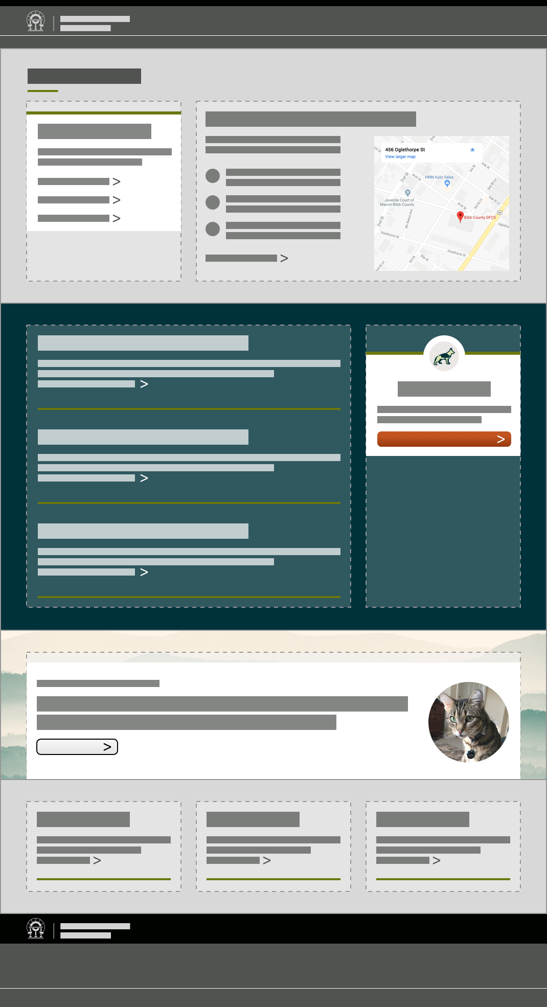
Block Type – This is where you select what type of micro-content that the block will be. Examples include Location Teaser, Promo, Link List.
Display Options – Depending on the block type that you use, some various display options may be provided. These display options vary from block type to block type.
Card – Most block types can be displayed as a card. This gives the content block a background color which is automatically determined by the color pallete of your site and the color of the region that it is in. There will also be an accent color at the top of the block. This should be used to help that individual block to stand out on the page and give it more visual prominence on the page. It's recommended that the use of this styling is limited otherwise the visual impact will be lost.
Card Icon – Blocks displayed as cards can also include an icon. This icon will be displayed in a circular spot at the top of the card.
Image – Most block types can also include an image. This type of image will be displayed in-line with the block text, not as a background image.
Other attributes of blocks are contained within the content creation forms. See the Content Type Training Documentation for more information.
For some examples of different block types, please see this downloadable PDF.
Nesting Regions and Blocks
Nesting is a term that refers to objects that live inside of one another. We've established thus far that blocks nest within regions which nest inside of sections; however, on the D8 platform Landing Pages are afforded a lot of layout flexibility with the ability to nest multiple regions within a section and/or multiple blocks within a region.
You can't nest a Section within another Section – Sections are full width objects that provide the foundational level of organization for your page.
Sections can contain multiple regions
Regions can contain multiple blocks
Block from one region don't effect blocks in another region or section.
Blocks will always automatically be sized appropriately for the region that it is contained in – full width single column, 2/3-1/3 columns or 3 column.
Landing Page alternative: embedding Blocks inside the text editor
If you want to include blocks on a page, but you don’t need a Landing Page, consider using a different content type and embedding blocks into the text editor. Certain content types (Book Page, Events, FAQ, How Do I, News, and Topic Page) allow for blocks to be embedded within the body text. This can be a useful approach if you want to highlight related content or break up a “wall of text” on a particular page.