Crisp
Drupal 9 Preparation
We are continuing to prepare for the coming upgrade to Drupal 9.
Wide Tables Stack to Fit Space
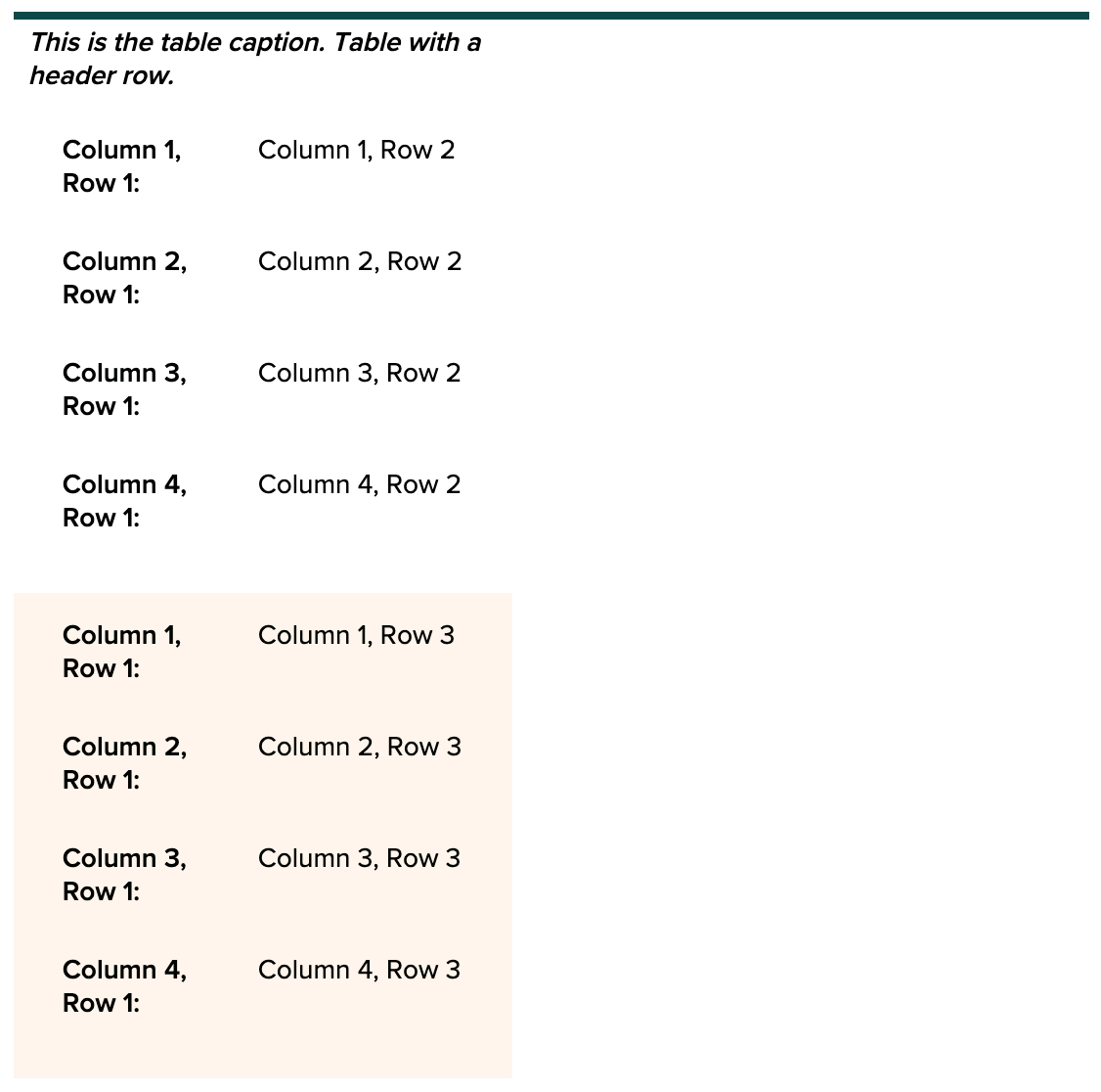
It’s often tricky to make tables display well online. Previously in GovHub, tables that were especially wide — because of the number of columns or the length of text — would sometimes run off the side of their provided space, and sometimes off the side of the window. We’ve updated tables to now respond to their width so that a table that would otherwise be too wide now stacks into a display previously reserved for the mobile breakpoint. This makes sure that all users can always see the complete data, no matter their device or screen size.
Standard table display:
Stacked display:
Preview Button Removed
The button to preview Topic Pages, Landing Pages, and other content types has been removed. This functionality often did not work well and the ability to Save as Drafts serves the same purpose, which is to view the page before it’s published.
Bug Fix: “Enter” on Add Content Page Search
The page for selecting a new content type to add to GovHub sites uses a display option called Type Tray, meant to let content creators more easily find the right type of node for their content. At the top of this page, there’s a search bar. This search actively filters the list as you type, but we found some users would still press the “Enter” key out of habit. Previously, pressing “Enter” would unexpectedly jump users to the website’s homepage. We’ve fixed this so that pressing “Enter,” though not necessary to activate search, keeps users on the Add Content page. We also contributed this fix to the Type Tray module so non-GovHub websites using this display can make use of the update.
Bug Fix: Corrected Text Size for Webform Field Labels
Orchard’s typography system is set up to use responsive type styles, meaning they will change size, weight, and line-height across different window sizes to be most appropriate for the context. Previously, several form field labels displayed at a static font size, affecting the hierarchy compared with other text on the same page. We’ve fixed this text so it responds to window size, just like all other text.
Before
After


