Dawson
Drupal 9 Preparation
We are continuing to prepare for the coming upgrade to Drupal 9.
Table Colors on a Dark Background
There are a few certain instances — for example, a Contact Directory on a Landing Page — in which you might put a table on a dark background. We’ve updated the colors on these tables so they look clean and, more importantly, are readable and accessible.
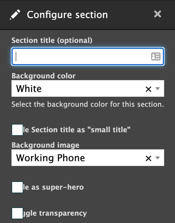
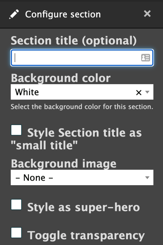
Bug Fix: Layout Section Configuration Panel
There are a few certain instances — for example, a Contact Directory on a Landing Page — in which you might put a table on a dark background. We’ve updated the colors on these tables so they look clean and, more importantly, are readable and accessible.
Before
After
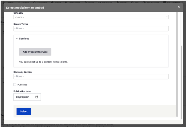
Bug Fix: "Select" Button in Add Document
When adding a new Document to a page in GovHub, an “Add Document” pop-up window opens in front of the page’s edit screen. When we updated the admin interface theme to Claro (in the Chattahoochee release), the “Select” button at the bottom of the window ended up overlapping with the Publication Date field. Now, we’ve fixed this display so all items in the Add Document modal stack as expected.


