Clayton
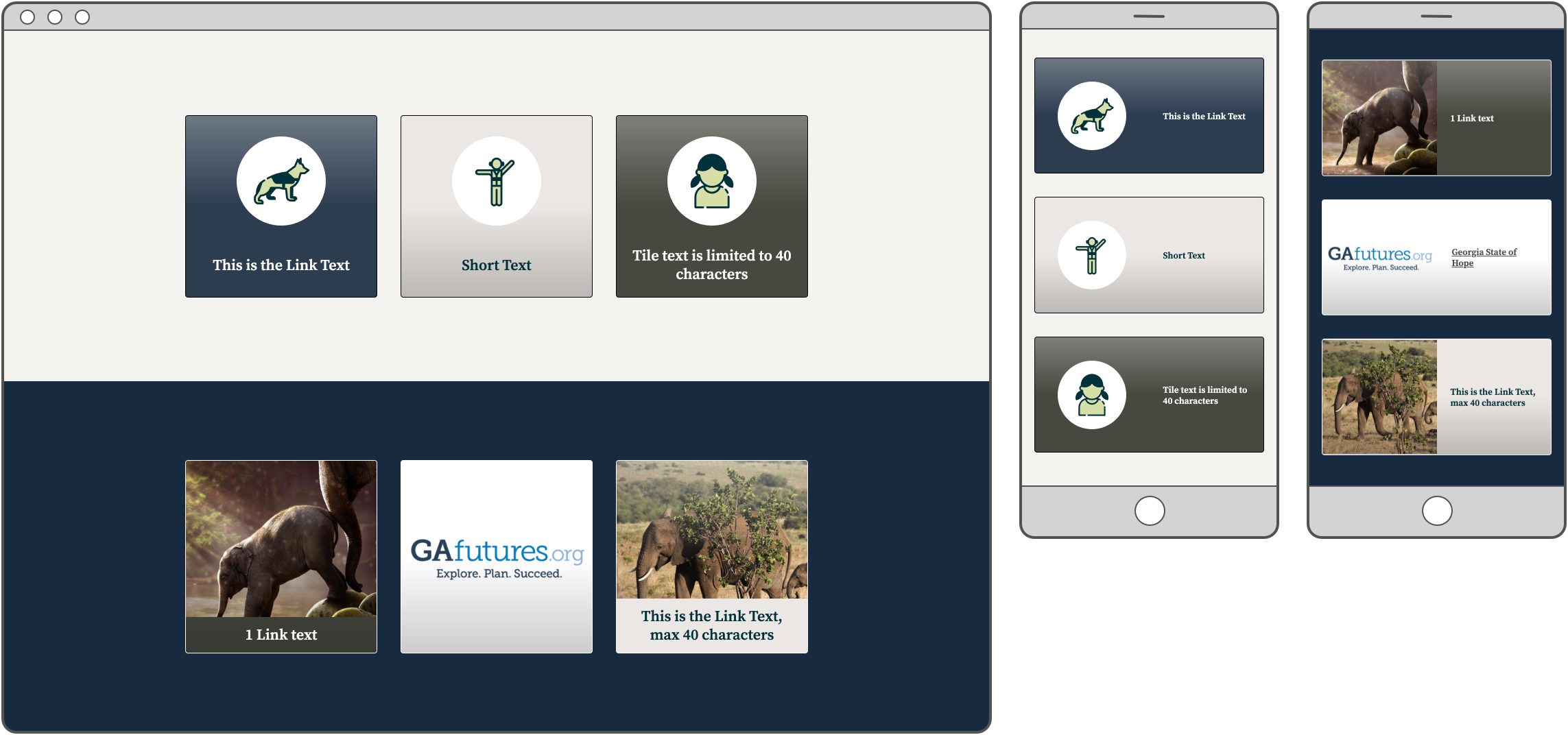
Tile Gradients
We’ve updated the gradients used on Tiles to display best depending on the Tile layout (Image, Image with Text, or Icon with Text), color, and breakpoint. This gradient is included to help users understand that the Tile is clickable, much like the gradient on buttons.
Icon Link Colors
We updated the color of link states on Icon Links. Now, when an Icon List is on a light background, the Icon’s stroke color always matches the color of the text. When the Icon List is on a dark background, the color of the circle behind the Icon always matches the color of the text. This adjustment further confirms the interaction for users and unifies the design.
CAPTCHA Removed from Webforms
We removed the CAPTCHA/reCAPTCHA element from all existing Webforms. This prepares us for an upcoming sprint in which we will disable the module, preventing editors from adding the CAPTCHA/reCAPTCHA element to any Webform. We are making this change in response to caching issues related to CAPTCHA. Other security measures are still in place that will effectively prevent spam submissions.
Bug Fix: “About the Author” Headshot Displays in Perfect Circle
We fixed a bug introduced in the previous release causing headshots in the “About the Author” block on News to display in their original aspect ratio, rather than always in a perfect circle. These headshots now always display in a perfect circle.
Bug Fix: Remove Empty Space Next to Photo
In certain instances (based on operating system, browser, window width), empty space displayed next to the headshot on a Bio page. We’ve removed this extra space so now the text flows around the image as expected.
Before:
After:


